
Get natural, vibrant tones without overdoing it
Nature is full of color — but your camera doesn’t always capture what your eyes saw.
Maybe the greens look too yellow. The sky seems dull. Or everything has a weird color cast.
That’s where color correction comes in.
Not filters. Not crazy edits. Just clean, balanced colors that feel true to life.
Let’s learn the basics.
What Is Color Correction?
Color correction is the process of:
- Balancing white tones so whites look neutral
- Adjusting colors so they match reality (or your creative intent)
- Ensuring skin tones, trees, and skies look natural and consistent
It’s about making your photo look as you remember it, or even slightly better.
Step-by-Step Color Correction Workflow
1. Fix the White Balance First
- Use the Temp and Tint sliders in Lightroom
- For natural light scenes, aim for:
- Daylight: ~5200K
- Shade: ~6000–7000K
- Sunrise/Sunset: adjust for creative warmth
Tip: Use the eyedropper tool and click on something neutral (grey/white stone, shirt, bark).
2. Adjust Vibrance and Saturation
| Setting | What It Does |
|---|---|
| Vibrance | Boosts muted colors, protects skin tones |
| Saturation | Boosts all colors equally (can look fake) |
Use Vibrance first, then fine-tune with Saturation if needed.
3. Fine-Tune with HSL Panel (Hue, Saturation, Luminance)
This is where you gain full control.
| Target | Adjustment |
|---|---|
| Green trees too yellow? | Shift Hue slider from yellow → green |
| Sky too pale? | Increase blue Saturation, drop Luminance slightly |
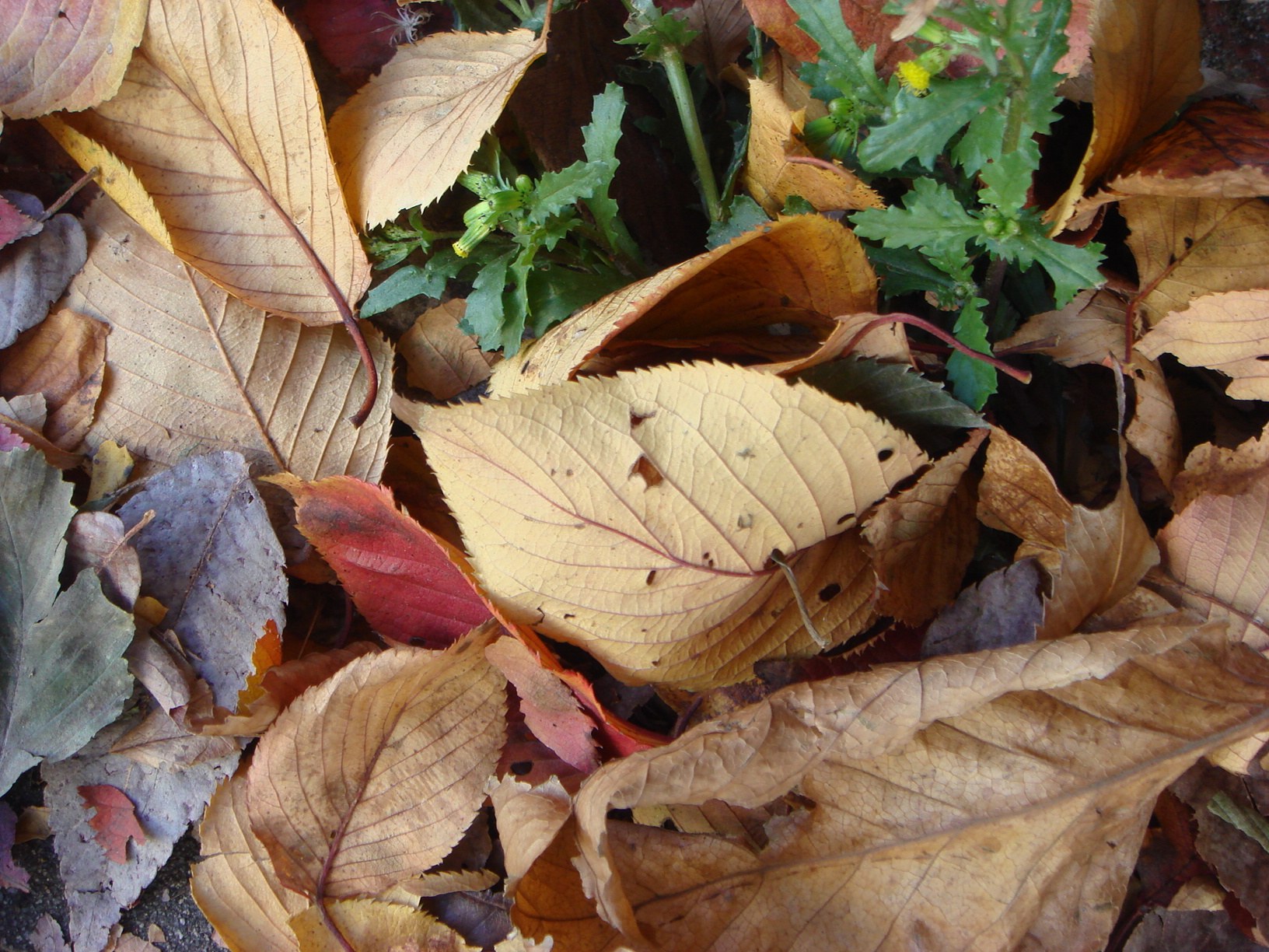
| Autumn colors flat? | Boost red/orange Saturation and contrast |
| Skin tones too magenta? | Adjust Orange Hue and Tint |
Tip: Don’t push all sliders too far — subtle adjustments are more realistic.
4. Use Calibration Panel for Global Color Feel (optional)
The Calibration tab (in Lightroom Classic) lets you tweak how all tones behave, especially useful for:
- Making greens pop in forests
- Giving a warm film-like glow
- Enhancing blues in water or skies
Quick Fix Examples
| Problem | Solution |
|---|---|
| Dull forest scene | Increase Vibrance, reduce Green Luminance |
| Blue-tinted snow | Increase Temp slightly, +Tint if needed |
| Yellow sunset looks flat | Drop Highlights, increase orange Saturation |
| Greens look “neon” | Shift Green Hue toward yellow, reduce Saturation |
Final Thought
Great outdoor photos aren’t made by cranking the saturation.
They’re built through subtle, intentional color decisions that bring your scene to life.
Start with a reference, not with the sliders
Color correction goes faster when you decide what “correct” means before you move anything. In the field, that starts at the camera: shoot RAW, set white balance to a fixed preset (Daylight or Cloudy) instead of Auto so a whole series shares the same starting point, and photograph a grey card in the same light at the start of each location. On the back of the camera, check the RGB histogram rather than the luminance one; a red channel climbing the right wall on a sunset, or a blue channel clipping in a snow scene, warns you about colors that cannot be recovered later.
Back home, open the reference frame first. In Lightroom Mobile, tap the White Balance eyedropper in the Color panel and touch the grey card, then copy those Temp and Tint values to every other frame from the same spot. In Snapseed, the White Balance tool has the same eyedropper; the Warmth slider inside Tune Image is a coarser control and should only be used for small creative shifts of -10 to +10. Only once the neutral is set should you judge the greens, blues and oranges.
When the neutrals look right but a single color still feels off, use the Color Mix (HSL) panel with narrow moves: Hue between -10 and +10, Saturation between -15 and +15, Luminance between -20 and +10. Larger changes usually mean the white balance was wrong, so go back a step rather than piling on corrections.
Common color mistakes and how to fix them
The first classic error is warming a whole forest scene because the shade felt cold, which turns the greens yellow and muddy. Fix it by leaving Temp alone and instead lowering Green Luminance by 10 to 20 and nudging Green Hue toward blue by about 5. The second is boosting Vibrance on a shot that already has strong reds or oranges, which makes them clip into flat blocks of color. Watch the histogram while you drag; if the red channel piles up on the right, back Vibrance down and use Orange Saturation alone.
Mixed light is the third trap: a hiker in warm evening sun standing in front of a blue, shadowed valley. There is no single white balance that works, so use a mask. In Lightroom Mobile, add a Masking layer with Select Subject, lower its Temp by 300 to 500 K, and leave the background alone. In Snapseed, the Selective tool placed on the face with Saturation at -10 does a similar job. Never chase this with a global Tint move; the magenta shift ruins skies.
- Practice run: pick three photos from the same hike shot at different hours: morning shade, midday sun and late golden light. Set white balance from a neutral in each, match the greens across all three using only HSL Luminance and Hue, then view them side by side. If they read as one consistent day, the correction is done; if one frame jumps out, it is almost always the Temp value, not the HSL panel.