
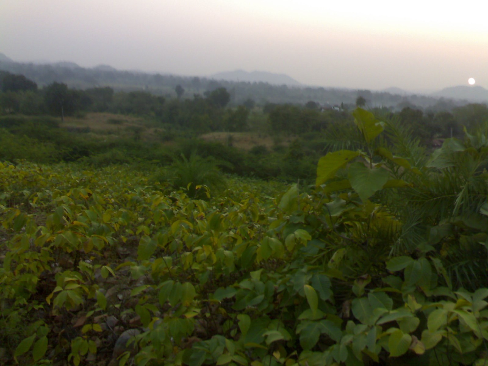
Let your photo breathe while still enhancing its full potential
We’ve all been there: you finish editing a photo, and it looks… intense. The sky is radioactive, the greens are neon, and the details are crunchy.
While editing is essential, too much can quickly break the magic.
Here’s how to enhance your outdoor photos without making them look fake.
Why Aim for a Natural Edit?
- Nature is already beautiful — you don’t need to exaggerate it
- Viewers respond better to believable light and color
- Overediting can reduce trust and connection in your photography
- A clean edit ages better over time than trendy filters
Natural doesn’t mean “unchanged” — it means refined, not distorted.
Common Signs of Overediting
| Symptom | Cause |
|---|---|
| Oversaturated sky | Too much Saturation or Blue Luminance |
| Harsh details | Too much Clarity, Texture, or Sharpening |
| Unrealistic skin tones | Incorrect white balance or Tint |
| Muddy shadows | Crushed blacks or overuse of Dehaze |
| Flat-looking image | Over-lifted shadows or faded contrast |
Tip: Take a break, then come back — if the photo looks unnatural after 5 minutes, dial it back.
How to Keep It Natural (Step by Step)
1. Start with a Balanced Exposure
- Don’t lift shadows too much
- Recover highlights without flattening the light
- Aim for realistic contrast
2. Use Vibrance, Not Saturation
- Vibrance protects skin and sky tones
- Saturation affects all colors equally — use carefully
3. Mind the Whites and Blacks
- Keep some true black and white points for depth
- Don’t let the histogram look like a flat mountain
4. Tweak Color Thoughtfully
- Use HSL to refine (not exaggerate) greens, blues, oranges
- Adjust White Balance gently to match the scene’s emotion
Creative Doesn’t Mean Overcooked
You can still:
- Add mood with subtle vignetting
- Enhance fog with soft Dehaze
- Boost storytelling with radial filters
But always ask:
“Does this still look like it could happen in real life?”
Practice Idea
Edit one photo three different ways:
- Soft natural edit
- Bold, saturated version
- Black & white
Then compare: Which one feels truer? Which one communicates the feeling of the moment?
Try this with forest hikes – LetsGoPlayOutside
Final Thought
The best edits are the ones where the viewer doesn’t notice the edit —
only the emotion and beauty of the photo.
Slider ranges that keep an outdoor photo believable
Natural editing is easier when you give yourself limits before you start. In Lightroom, set White Balance first, either with the eyedropper on a neutral gray rock or by nudging Temp no more than a few hundred Kelvin from the camera reading. Then work the Basic panel from the top: Exposure within plus or minus 0.5, Highlights between -20 and -60 to bring back clouds, Shadows between +10 and +35, and finally Whites and Blacks. Hold the Alt or Option key while dragging Whites and Blacks so you see exactly where clipping begins, and stop just before it. This keeps real black and white points while the midtones stay soft and natural.
For the presence sliders, use small numbers. Texture between +5 and +15 sharpens fine detail such as rock and bark without halos. Clarity should rarely go above +10 on a landscape, and it is often better at 0. Dehaze is the slider that ruins most outdoor edits: keep it between 0 and +10 globally, and if you need more, apply it through a mask on the distant hills only. For color, Vibrance between +10 and +20 is usually plenty, with Saturation left at 0 or +5. In the HSL panel, lowering the saturation of greens by 5 to 15 and lowering the luminance of blues slightly gives a calm, filmic sky instead of a neon one.
Masks are what separate a refined edit from a global one. Select the sky and pull Highlights down, select the subject and lift Exposure by +0.2 to +0.4, and leave the rest alone. Two or three targeted masks with small values look far more natural than one strong global adjustment.
How to check your work and catch overediting
Use the backslash key to flip between before and after; if the after version looks like a different day, you have gone too far. View the photo at fit-to-screen size and again at 100 percent, because halos, noise and crunchy edges hide at small sizes. Look at the histogram: a natural landscape usually has a gentle hill, not a wall pushed against both edges. Check a neutral area such as gray rock or pavement; if it has picked up a color tint, back off the Temp, Tint or HSL changes.
A practical exercise is the half-strength test. Edit a photo until you are happy, then create a virtual copy and cut every slider value in half. Compare the two on a phone screen and again the next morning. Most beginners find the half-strength version more pleasing, which tells you how much your eye adapts to strong edits while you work. Repeat this on a set of five images from one hike and notice how the winning values converge into a consistent, restrained recipe you can save as a preset and adjust per image.