
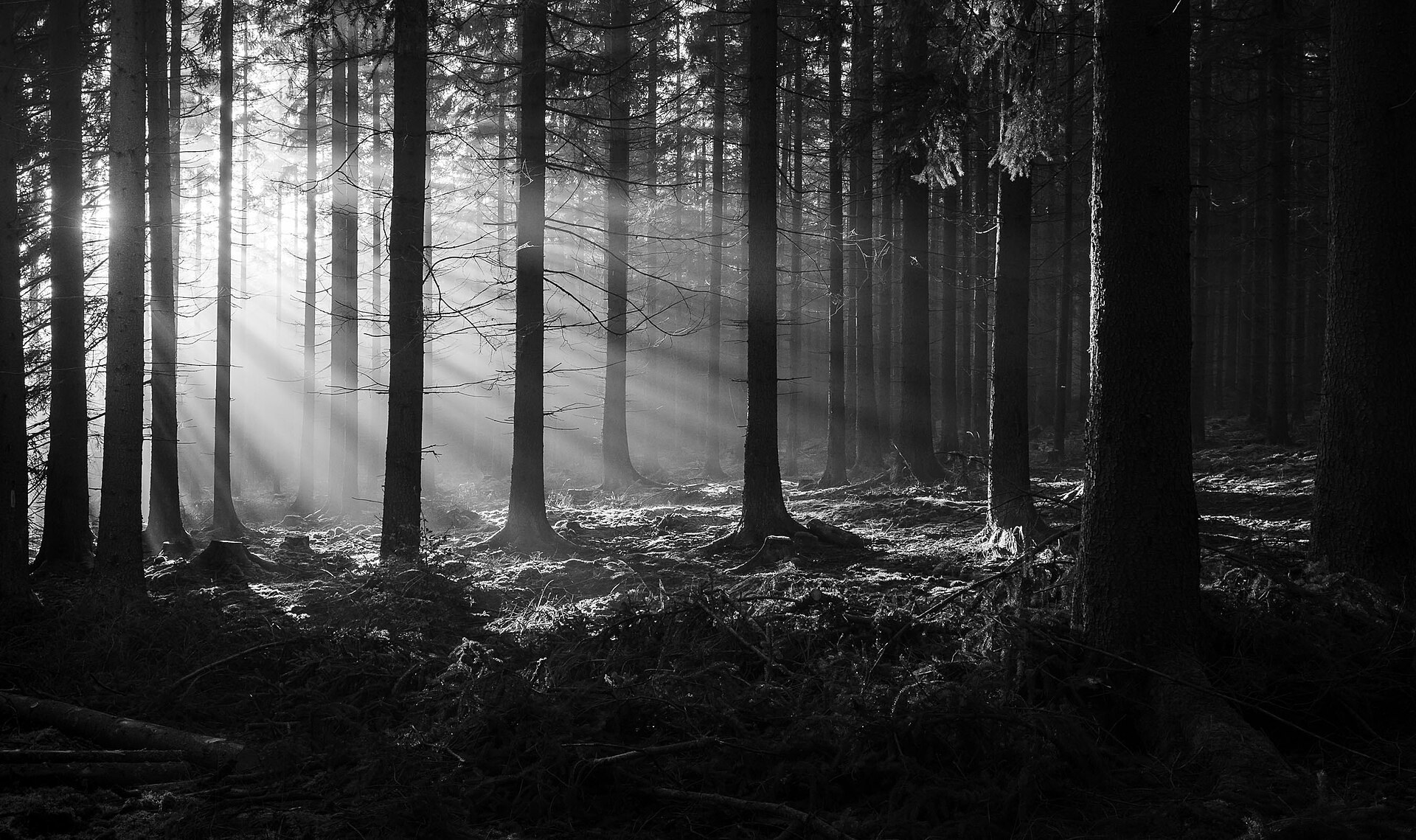
Give your photos depth, drama, or softness — through subtle editing
Some outdoor photos are technically fine — but they feel flat.
No tension, no glow, no mystery. That’s where light and shadow editing comes in.
In this guide, you’ll learn how to shape mood and depth in your landscape or nature shots using simple post-processing tools.
Why Light and Shadow Matter
Light tells the story. Shadow shapes it.
By adjusting the balance between them in post-processing, you can:
- Create drama and contrast
- Emphasize your subject
- Simulate natural glow or haze
- Add a sense of time, weather, or emotion
Mood isn’t always in the camera. Sometimes, it’s built after.
Where to Start (Global Adjustments)
Start in Lightroom, Snapseed, or any RAW editor:
| Adjustment | Use |
|---|---|
| Highlights | Recover blown skies or tone down bright spots |
| Shadows | Lift or deepen for balance |
| Whites/Blacks | Control contrast anchors |
| Clarity / Dehaze | Add structure or misty softness |
Don’t lift shadows too much or the image may feel flat again.
Creative Techniques
1. Dodge & Burn (Lighten/Darken Selectively)
- Use Lightroom’s Brush or Snapseed’s Selective Tool
- Lighten key areas (faces, trails, subject)
- Darken edges or unimportant zones to focus the eye
Use a low flow (10–20%) and build up gradually.
2. Add Light With Radial Filters
- Simulate sun rays or soft glow
- Place over subject or along trails
- Increase exposure, warmth, and clarity slightly
Optional: Add feathered vignettes to simulate lens falloff
3. Use Tone Curves to Shape Mood
- Slight “S-curve” = deeper contrast and punch
- Lift black point = faded, moody film look
- Drop highlights = cinematic softness
Tone curves are powerful — use subtly and preview often.
4. Color and Mood Go Together
- Warm shadows = cozy, late afternoon feel
- Cool shadows = alpine or misty vibes
- Split toning (Color Grading panel):
- Add warm tones to highlights
- Add blue/teal to shadows
Advanced Color Grading Techniques – Adobe Lightroom
Example Use Cases
| Scene | Mood Goal | Tools to Use |
|---|---|---|
| Forest with filtered sun | Magical, calm | Radial light, warm temp, fade blacks |
| Foggy morning | Mystery | Lift shadows, reduce clarity, cool tint |
| Harsh light mountain | Drama | Strong contrast, deepen shadows |
| Sunset hike | Warm, nostalgic | Golden WB, slight vignette, rich highlights |
Final Thought
You don’t just capture light — you shape it in post.
Learning to control light and shadow after the shot is what makes an edit feel cinematic, emotional, or timeless.
A repeatable order for shaping light in Lightroom
Random slider dragging produces random results. Work in the same order every time and you will know which move caused which change. Start with Exposure to set overall brightness, usually within -0.5 to +0.5 for a well-exposed RAW. Then pull Highlights between -30 and -70 to recover skies and bright foliage, and adjust Shadows between -20 and +40 depending on whether you want mystery or openness. Only then set the anchors: hold Alt or Option while dragging Whites until a few pixels just start clipping, and drag Blacks until the darkest area barely touches pure black. These two sliders create most of the depth people mistake for contrast.
Next, texture and atmosphere. Dehaze at +10 to +25 adds weight to a flat overcast scene; at -10 to -20 it thickens fog. Clarity between +5 and +20 gives mid-tone punch on rock and bark, while Texture at +10 to +30 sharpens fine detail without the crunchy halos Clarity can leave. Finish with the Color Grading wheels: a small warm shift in Highlights and a cooler shift in Shadows, both under 15 in saturation, is plenty. If greens look neon, drop Green Saturation and push Green Hue slightly toward yellow in the HSL panel.
Now check before you export. Zoom to 100 percent along bright edges such as ridgelines and tree tops and look for a glowing halo; that is Dehaze or Clarity pushed too far. Open the histogram and confirm the left edge is not a wall of clipped black. Toggle the Before/After view and ask whether the scene still looks like a place you could stand in.
Local light with masks and the mistakes to avoid
Global sliders set the mood; masks direct the eye. Add a Linear Gradient from the top with Exposure -0.3 to -0.7 to darken a sky, then use Subtract with Luminance Range so the gradient skips the bright clouds. Add a Radial Gradient over the subject or a patch of trail with Exposure +0.2 to +0.5, Temperature slightly warmer, and feather at 70 to 100 so the edge is invisible. Invert a second radial with Exposure -0.3 and Dehaze -10 to fade the corners naturally instead of using the crude Vignette slider.
The classic mistakes are easy to spot once named. Lifting Shadows past +60 flattens the image and reveals noise; deepen Blacks instead. Stacking Dehaze and Clarity above +30 turns clouds grey and edges crunchy. Darkening every corner until the frame looks like a tunnel screams heavy editing. And warming the entire image to fake golden hour leaves snow, water, and skin an unnatural orange; warm only the highlights.
Field exercise: take one flat forest photo and make three versions in ten minutes each, aiming for calm, drama, and mystery. Save each as a snapshot, then view them side by side the next day. The one that still looks believable is the one to keep.